A new name for new momentum!
Discover the reasons behind the name change and how this transformation reflects our ongoing commitment to our mission and our desire to create an even greater impact.
A new name for new momentum!
Discover the reasons behind the name change and how this transformation reflects our ongoing commitment to our mission and our desire to create an even greater impact.

Humundi is much more than a name change. It symbolises our ambition and commitment to a fairer world that respects human rights and the planet. The name is a fusion of two significant words: Humain and Mundi.
The word “Human” evokes our humanity and highlights fundamental rights, in particular the right to food, which is at the heart of our action. It reminds us that the road to a fairer world depends on our individual commitment, but also on our collective commitment.
“Mundi” embodies the idea of globality and global solidarity, underlining the fact that food and agriculture are global and interconnected issues. These issues concern us all and require an approach that is both local and global, taking into account both human and global dimensions.
In choosing the name Humundi, we wanted to establish a strong link between our vision and our identity, highlighting the essential values that guide our commitment.
« Because healthy agriculture for producers and consumers is also healthy for the planet and the next generations ».
This new name highlights the crucial importance of preserving the land that feeds us and the ecosystems that surround it through the development of small-scale farming. It reaffirms our unwavering commitment to the defence of human rights and our ability to act in their defence. It also expresses our deep attachment to solidarity and social justice on a global scale, which are fundamental pillars of our action and our partnership-based approach.
SOS Faim has become Humundi, a name that embodies a new way of thinking about the issue of hunger: to feed the world, it is essential to take care of people and the planet, and this is happening today.
Humundi reflects our desire to extend our action to meet today’s challenges and promote the emergence of Sustainable Food Systems. We want this name to resonate as a call to amplify and extend the progress made by SOS Faim.
Our mission remains unchanged, but our methods are evolving and adapting to the current global situation and challenges.
Faced with the failures of the global food system, which leave 828 million people hungry, plunge millions of farmers into extreme poverty and exhaust our planet, Humundi firmly believes in agroecology and its essential role.
We are convinced that the key to feeding the world sustainably lies in a global approach based on solidarity, bringing together all the players involved in the agro-ecological transition, from production to consumption.
« Humundi, because together we can cultivate a fairer world ».
That’s why Humundi is committed to supporting not only producers, but also other players in the food chain. By working together, we will accelerate the agro-ecological transition and put in place sustainable solutions.
By choosing to call ourselves Humundi, we are affirming our commitment to working hand in hand with our 70 partners to co-construct a fairer world where everyone has access to healthy, sustainable food.
As Humundi, we embody this vision and call for collective action to make our food systems fairer, more inclusive and more sustainable.
Our objective is clear: a future where food justice becomes a reality, where natural resources are preserved and where every individual has access to healthy food.
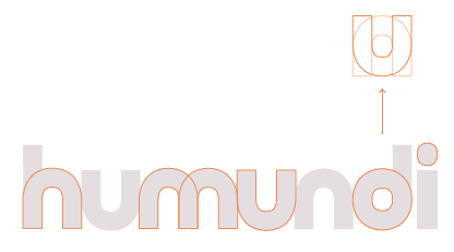
The Humundi logo has been carefully designed to reflect our identity and mission. We opted for a simple but meaningful design that represents our commitment to building bridges between the various players involved in the food transition.

The Humundi logo symbolises this vital connection between the different players in the food chain. It is made up of an element repeated to form a coherent whole, like a solid bridge linking producers and consumers.
Our logo also incorporates a symbol that expresses our dynamic commitment to agro-ecology. Its circular shape represents a virtuous circle, symbolising both a plate and our determination to promote healthy, sustainable food.
We’ve used two colours to represent our vision: aubergine, which evokes energy and positivism, and lime green, which invokes action and demands. These colours reflect our desire to be a dynamic force in the promotion of peasant farming and agroecology.
We’re proud of our logo, which perfectly embodies our values and mission. We hope you will share our enthusiasm for this new chapter in the history of our organisation.